It’s been two years since we launched Crossbeam, and no two days have been alike. But nothing has been more exciting than watching a network graph take form before our very eyes.

We’ve spent a lot of time unpacking what’s going on here, and we’ve realized that this particular kind of network graph is unique for a few reasons:
- It’s not a social network like LinkedIn because the connections are between companies, not people.
- It’s also not a marketplace network graph, because there aren’t “buyers” and “sellers” or some other two-sided or n-sided dynamic.
- And it’s much more than “data network effects” where SaaS companies roll up user data to improve their product—no, the graph itself is our product.
Crossbeam is building a true “B2B network graph” where the nodes are companies and the edges are connections (or partnerships) between those companies. We haven’t been able to find many of these graphs out in the wild, but we have reason to believe many more are coming.
In this post, we’ll share our learnings and data about where else these B2B network graphs exist, the network effects they can generate, and how we measure and manage the B2B network graph we’re building at Crossbeam.
What to expect:
- B2B Network Graphs 101
- B2B Network Graphs In the Wild
- Measuring B2B Network Graphs and the Resulting Network Effects
- What’s Next
B2B Network Graphs 101
What They Are
B2B network graphs will exist when relationships between companies in your customer base amplify (or even define) your product’s value proposition.
To have a true B2B network graph, three things must be true:
- The connections on your graph are between companies, not people.
- Those connections are key to how those companies derive value from your product.
- The specific identity of each company is important for creating that value.
If any of these qualifiers is untrue, you’re likely building one of the other network graphs or network effects listed below (or none at all).
What They Aren’t
Virality. Virality is characteristic of network effects businesses, but not sufficient evidence of one. If you have a kickin’ referral program, for example, you might tap into viral growth mechanics as your customers recommend your product to people in their networks (and then those people do the same for their networks). But if those buyer relationships don’t impact your product experience, the effects stop at the top of your funnel. (Rapid-fire examples: Superhuman’s referral-only invite system or Dropbox’s early “refer friends and get free storage” tactic.)
n-Sided/Marketplace Network Graphs. Here, the network is made of two or more “types” of participants. Buyers and sellers make up marketplaces, for example. In marketplaces, the value of the connection is ephemeral, and the identity of who you connect with is less important than the transaction you do with them. (Rapid-fire examples: Upwork or Amazon Mechanical Turk)
Data Network Effects / Co-Ops. Most SaaS companies who claim to have network effects really just have these. Data network effects appear when you are using data from your user base to train algorithms, workflows, or other feedback loops to make your product better. Here, the actual user-facing graph is quite weak or non-existent. In other words, the way a user experiences the network graph is less explicit. (Rapid-fire examples: CrowdStrike or ZoomInfo)
Siloed Network Graphs. Sometimes collaboration between users within an individual company can form a network graph that drives stickiness and adoption. However, each company is basically its own siloed network graph that rarely crosses outside of company walls. (Rapid-fire examples: collaborative software like Jira or Miro)
Transient Networks. Some B2B products involve cross-company interactions, but the experience and value to the counterparty can be ephemeral with no commitment or investment required. This creates explosive viral effects but almost no true network effects. (Rapid-fire examples: DocuSign or Zoom)
Social Network Graphs. Sometimes B2B products can see user-level network effects when the relationships between people transcend the relationships between the companies. If an individual continues to own and manage their respective node on a given network graph even after they change jobs, that node is part of a social network graph. (Rapid-fire example: LinkedIn)
These various network graphs, network effects, and growth strategies could be big force multipliers for your company—they’re just not what we’re talking about here.
B2B Network Graphs In the Wild
So, what products are building real B2B network graphs? Slack Connect, Snowflake Data Exchange, and Crossbeam, to name a few.
All three of these products emerged in the last few years. This timing is no coincidence—the emergence of B2B network graphs dovetails with the maturity of the API economy, remote collaboration exploding in relevance, and increasing compliance constraints pulling workflows out of insecure channels like email and into more purpose-built tools.
Slack Connect
Better known as Slack Shared Channels, Slack Connect is the perfect example of a modern tech player building a B2B network graph to tee up a “next chapter” of growth for its business. In its early days, Slack offered individual companies their own siloed workspaces. But the emergence and spectacular growth of shared channels and company-to-company connectivity has been at the core of making Slack even stickier across the SaaS ecosystem.
 Slack Connect Network Graph circa December 2019. Image courtesy of Slack.
Slack CEO Stewart Butterfield beat us to the punch here with his 2019 post titled, “Why Shared Channels are So Cool.” Slack’s investment in its B2B network graph has only grown since then.
Snowflake Data Exchange
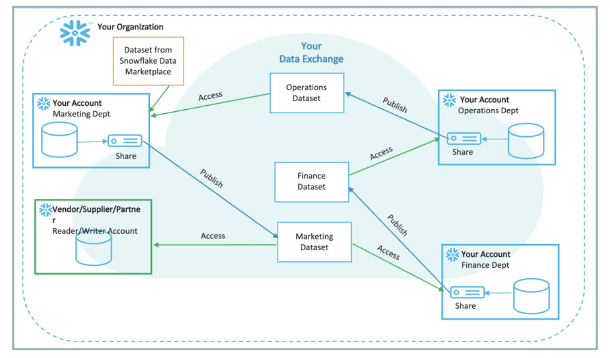
This is a brilliant B2B network graph play. Data infrastructure has historically been a vertical in which products are siloed within the companies that use them, but Snowflake is breaking down those barriers with its Data Exchange offering. Here, Snowflake is allowing its users to safely query each other’s data warehouses, often obviating the need for complex APIs.
 The topology of a node/edge pairing in Snowflake’s B2B Network Graph. Image courtesy of Snowflake.
They’re building a B2B network graph, with their data warehouses serving as the nodes.
Crossbeam
A B2B network graph sits at the core of the Crossbeam product. Companies on Crossbeam connect with each other to find overlapping customers and prospects, then use that data for account mapping, co-selling, and attribution.
In the following sections, we share some of the most important analytics about our B2B network graph and the techniques we use for measuring and managing its growth.
Measuring B2B Network Graphs and the Resulting Network Effects
Data Quality Considerations
As with any advanced analytics, how you cleanse and qualify your input data is critical. Otherwise, the “garbage in, garbage out” problem could lead you astray.
For Crossbeam, that means making sure we only count the companies that deserve to count. With this in mind, we implement a few steps in our onboarding workflow to ensure an accurate representation of our network growth:
- Disallow registrations from non-company email domains (like Gmail)
- Require email address verification during registration before a user can claim a company in Crossbeam
- Cross-check verified email domains against known “owned” company domains from independent data enrichment sources
- Manually inspect newly verified companies (and rejected claims) to provide a human sanity check on new network activity for key accounts
While this might feel like it could cause a lot of onboarding friction, we’ve run tests and have verified that these quality measures don’t actually deter qualified users from completing registration. Legitimate users are motivated enough to breeze through these steps in pursuit of joining the network, while junk signups are categorically eliminated.
Visualizing with Network Graphs
The visualization below shows the growth of the Crossbeam network graph during our first two years in the market.
 Crossbeam network graph by month (h/t Ben Garvey’s D3 lineage project)
In the network graph above, each dot (or “node”) represents a company on Crossbeam, and each line connecting them (or “edge”) represents a partnership between those companies.
Note how a “mesh” forms over time, as opposed to a universe of individual hub-and-spoke constellations. Even when a “supernode” company has a large number of partners, connections also form between those partners, which increases the density of the graph overall.
Building and maintaining this network visualization has been a key part of our company’s storytelling and analytics. Among other things, it helps us identify emerging network clusters and key nodes that could unlock new verticals or use cases.
As an example, we can color-code and resize nodes on the network graph based on dimensions like geography, revenue, partner ecosystem potential (powered by Partnerbase data), and more. The static image below sizes nodes according to the number of partners in their ecosystem and color-codes them according to their corresponding account owner from Crossbeam.
 Portion of Crossbeam network graph, nodes scaled by ecosystem potential (h/t Sigma js)
Our team can zoom in, click on individual nodes to see a company’s details, and even isolate portions of the map to observe an individual company’s partners. It’s a fun and powerful tool for discovering new areas of opportunity and understanding growth patterns over time.
Visualizations are helpful for exploration, but specific metrics are necessary in order to quantify progress, set goals, and act on the data.
Measuring Network Density with Cohort Analysis
The average number of partners per company (or edges per node) is known as “graph density.” The simplest way to analyze this metric is to divide the number of edges by the number of nodes over time, as shown below.
 Network density growth by calendar date
While the green line representing density is indeed growing over time, this actually shows us a pretty unhelpful picture of what’s actually going on. The mere fact that the ratio is less than one suggests there’s much more to the story.
What’s happening here is that high network growth is causing “newer” companies to represent a huge percentage of the user base, dragging the average age of a network node down and therefore disproportionately representing the network sizes of newer signups.
A more precise way to look at this metric is with a cohort analysis, where we group companies based on the quarter in which they joined the network (i.e. when the company got its first partner on Crossbeam) and then track the average number of partners among the companies in each group over time.
Our network density growth by cohort:
 Network density growth by cohort
That’s more like it. This graph paints a far more accurate picture of how network density grows over time, with the average company in a given cohort continuing to build out the size of its network in a linear fashion even two years into its existence on Crossbeam. Excitingly, the newer cohorts are performing just as well as the ones filled with early adopters — despite being an order of magnitude larger in size.
Measuring Viral Growth with K-Factor
The virality coefficient known as k-factor isn’t new in tech circles—it’s been tossed around since at least the days of MySpace. Sometimes referred to as R-zero or the virality coefficient, it measures one thing: for any new member of the network, what is the average number of additional members they will be responsible for adding? On a B2B network graph, a “member” is a company.
The k-factor metric is incredibly impactful. At any value greater than 1.0 (meaning each new member will invite exactly one more new member), the network growth is inherently exponential in nature. As others have observed in the past, even a low k-factor can be a powerful growth multiplier. 
Unfortunately, accurately estimating k-factor in the midst of a growing, evolving business is challenging for the same reason that it’s hard to accurately reflect density growth: huge new cohorts are always skewing the numbers.
As a result, simply dividing “new signups via invitation” by “total companies in network” would create an inaccurate picture of what’s really going on. Instead, we monitor what we call a “new invitation decay rate” on a cohort basis.
Using this decay rate, we can extrapolate the performance of our younger cohorts into something that can be combined apples-to-apples with our older ones, removing any time-based biases and giving us a more accurate look at our k-factor.

The graph above echoes the cohort analysis we talked about in the last section: A company sends new invitations to other companies to join them on Crossbeam on a steady, linear basis throughout its life cycle. As of today, the average company sends about 33% of their lifetime invitations by their 90-day mark.
This statistic gives us a benchmark for predicting future invitation rates for companies that are young to the network. We use it to standardize our analysis of invitation activity, giving us a clear model of network-wide k-factor. (Our analytics system updates these inputs automatically over time as we get more data.)
Reporting this metric has become a staple in our all-hands meetings and objectives and key results (OKRs). The entire team at Crossbeam has visibility into how our k-factor has climbed over time.

We focused on k-factor relentlessly in our first year using product-led growth (PLG) tactics and pricing/packaging optimization. While our k-factor has held steady in the last few quarters, we think there is still room to go higher and we’ll be keeping this metric top of mind this year.
The Output: Exponential Growth
B2B network graphs are inherently viral, and a key way to track progress is to watch for their sustained exponential growth.
As early as our pre-launch private alpha, we started to see the beginnings of an exponential curve (although the y-axis was tiny). The graphs post-launch, at months six, 12, and 26 (today), show a similar curve with the y-axis growing by roughly an order of magnitude each time. The only significant change otherwise is the smoothing of the curve.
What’s Next
While historically rare, B2B network graphs seem to be popping up now more than ever. As the API economy continues to mature and data standardization becomes less of a lift, more companies using this business model will emerge.
For now, we’ll be keeping an eye out for new industries, playbooks, and tactics impacted by this model. Stay tuned.
Turn your ecosystem into your #1 revenue source
Get started in under a minute. Instantly capture insights from your partners. Identify more opportunities. Did we mention it’s free?


